R is a great tool for visualising data. Recently I’ve got a chance to work on a project which handles rather big amounts of data. I was told the data is big but I’ve never seen any visuals myself. One day I decided to collect more information about the data and plot some graphics.
Initially data was collected into csv files of the following structure:
client,type,subtype,size,name
bidswitch,aggregates,predict_price_2,114876,2013-02-15-00.bidswitch.prod.predict_price_2.tsv.gz
admaxasia,aggregates,budget_4,10398,2013-02-14_17:25:50.2013-02-15_00:15:00.admaxasia.prod.budget_4.tsv.gz
tokyo,logs,pixel,3802377,2013-02-15-19-30-00.CET.pixel_v36.userverlua-ireland22_338a1.log.gz
tokyo,logs,pixel,2695996,2013-02-15-19-30-00.CET.pixel_v36.userverlua-ireland25_a9a45.log.gz
Later the format has changed and a few fields were added: mtime, user,
group, perm. However in this acticle we will only need client and size
fields.
Know your enemy
So basically what I wanted to know is what amounts of data are flowing through the system? I was curious to know the number of files for each client and their total size.
R> data <- read.csv('all/raw/files-2013-02-15.csv')
R> dim(data)
[1] 167247      5
R> names(data)
[1] "client"  "type"    "subtype" "size"    "name"
R> length(list.files('all/raw'))
[1] 74
Not many files yet, but they’re counting every day and we can see something interesting today.
First steps
My first step was to take standart plotting functions and get somewhat acceptable plot where I can see the players. Being a novice in R I can say it was not that easy. After a lot of googling I got my first working prototype and it appeared to be quite lengthy and verbose.
#
# Plot number of files and total size of files per client from csv.
#
plotNullt <- function(file) {
par(mfrow=c(1,2))
d <- read.csv(file, head=T, colClasses='character')
d$size <- as.numeric(d$size)
sizes <- aggregate(d$size, by=list(client = d$client), FUN=sum)
sizes$x <- sizes$x %/% (1024 ^ 2) # b to Mb
total_size = sum(d$size) %/% (1024 ^ 2)
total_files = nrow(d)
# plot data size info
K <- length(sizes$x)
ord <- order(sizes$x, decreasing=T)
par(oma=c(3,0,0,0))
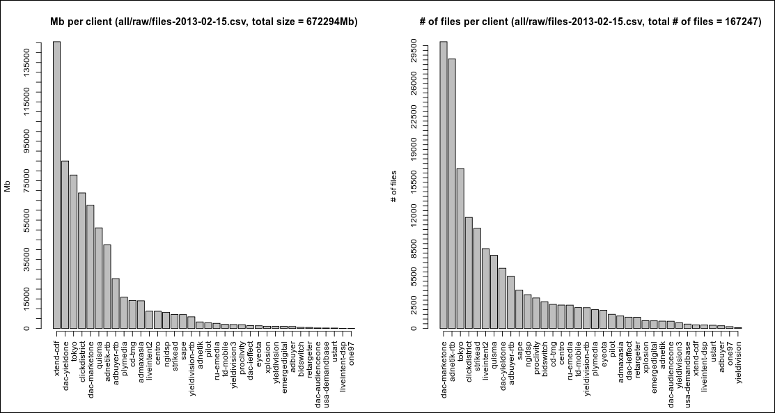
main <- sprintf('Mb per client (%s, total size = %dMb)', file, total_size)
a <- barplot(sizes$x[ord], axes=F, ylab='Mb', main=main)
m <- max(sizes$x)
axis(side=1, at=a, labels=sizes$client[ord], las=3)
axis(side=2, at=seq(0, m, 5000))
# files per client
clients <- unique(d$client)
x <- sapply(clients, function(x) nrow(d[d$client == x, ]))
lines <- data.frame(client=clients, files=array(x))
# plot # of files info
ord <- order(lines$files, decreasing=T)
main <- sprintf('# of files per client (%s, total # of files = %d)', file, total_files)
a <- barplot(lines$files[ord], axes=F, ylab='# of files', main=main)
m <- max(lines$files)
axis(side=1, at=a, labels=lines$client[ord], las=3)
axis(side=2, at=seq(0, m, 500))
}
In this function we’re plotting two plots. We use par and mfrow to specify
the number of rows and columns of subplots in our main plot.
Next we read the data from the file, making sure we get size column as numeric
values. It took me a while to figure out how to use aggregate the right way.
We use it to find the sum of file sizes for each client. This could probably be
implemented using powerful
plyr package but I’m
not familiar with it yet. It’s one line of code for aggregation already which is
good enough. Next we divide aggregated sums by 1024 ^ 2 to represent values in
Mb. Total size and total number of files is also remembered.
After that we draw our first plot. The most challenging part here was to provide
correct ordering: I wanted clients to be sorted in a decreasing order of their
respective values, be it file sizes or number of files. Another tricky part was
to rotate the axis labels by 90 degrees and to add more ticks to the axis.
The former one was solved with axis function and las parameter. The latter
one was simpler and only required to use at and seq.
Next I’m using sapply to calculate the number of files per client. This is
weird and I don’t know why I didn’t use aggregate again, it could be much
simpler.
And pretty much the same story with the second plot. The code is basically the same and except of a few different lines. The result looks as follows: